 Plain Lantern
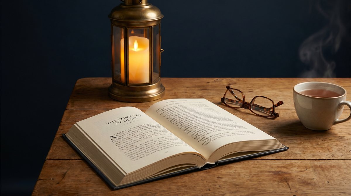
If you have ever bought a book labelled large print only to find the words still feel cramped and tiring, you already know the secret: not all large print is equal. Bigger letters are only the start. Whether you are choosing a book for your own aging eyes or as a gift for a parent or grandparent, a few simple details decide whether reading feels like a pleasure or a strain.
What “large print” actually means
Standard paperbacks are usually set in 10 to 11 point type. A genuine large-print book uses at least 16 point, and the most comfortable senior-friendly editions sit around 18 point. But the point size on the cover never tells the whole story. Two books can both claim “large print” and read completely differently, because comfort comes from how the whole page is arranged — not the font size alone.
The five things that make large print comfortable
1. Generous letter size and weight
Look for type that is not only large but a touch heavier, with clear, open letterforms. Thin, decorative fonts disappear for tired eyes even at a big size.
2. Strong contrast
Dark, near-black ink on warm off-white paper is far kinder than grey ink on bright white. High contrast does most of the work that magnification gets the credit for.
3. Space between the lines
Extra spacing between lines (leading) lets the eye move from one line to the next without losing its place. Cramped lines are the most common reason “large print” still feels hard.
4. Shorter, calmer line lengths
Very wide lines force the eye to travel a long way back to the left margin. Comfortable books keep lines a sensible width so reading stays relaxed.
5. Matte, glare-free paper
Glossy pages bounce light straight back at the reader. A soft, matte paper reduces glare — especially under a lamp in the evening, which is when many people read most.
Matching the book to the reader
Different readers need slightly different things, and a moment’s thought makes a much better gift.
- Low vision or failing eyesight: prioritise the largest, boldest type and the strongest contrast you can find, and keep page layouts simple and uncluttered.
- Reminiscence and gentle activity: nostalgia-themed puzzles and word searches are wonderful for keeping the mind active without overwhelm — look for clear grids and plenty of room to write.
- A calming, screen-free hour: reflective books and gentle workbooks give a sense of progress and quiet, which many readers value as much as the words themselves.
A simple checklist before you buy
Whether you are shopping online or holding a copy in your hand, run through these:
- Is the type at least 16–18 point, with clear, open letters?
- Is the ink genuinely dark against a warm, non-glossy page?
- Is there visible space between the lines, not just bigger words?
- Does the page feel calm and uncluttered, or busy and tight?
- If it is a puzzle or activity book, are the grids and answer spaces large too?
If a listing does not make these clear, it is worth asking or checking the “look inside” preview before buying.
Comfort is the whole point
Large print is not about making a book look different — it is about letting someone keep doing something they love for longer. The best large-print books disappear into the reading, so the words, the puzzle, or the quiet moment is all that’s left.
Every Plain Lantern Press title is made with exactly these details in mind: readable type, strong contrast, calm layouts, and paper that is kind to tired eyes. If you are choosing for yourself or for someone you love, you can browse the Plain Lantern library to find a book that feels comfortable from the very first page.